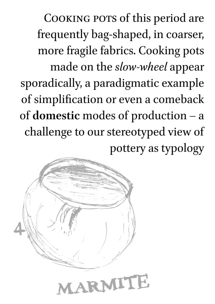
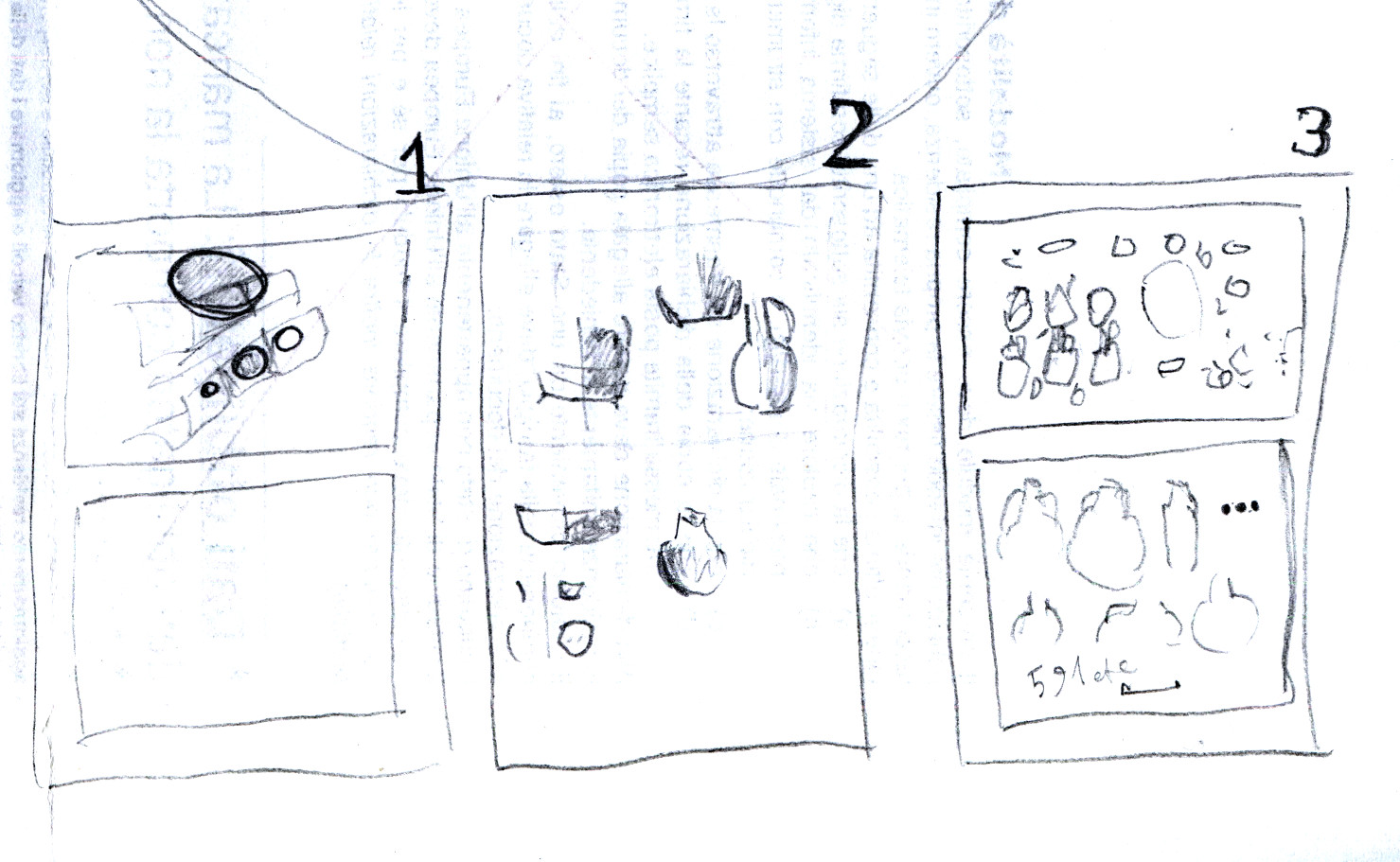
Who said PhD theses have to be boring texts with horrible typography?
Even if my thesis is far from being ready for discussion, I can’t help some diversion from the actual writing. Today I put together this experiment for an interlude page: imagine you’re skimming through dozens of pages and suddenly your eyes catch something different: a short sentence at font size 36, coupled with a rough sketch drawing of a Byzantine cooking pot, or the interior of a cellar where a young girl is walking to bring wine to the table.
 The drawings are mine ‒ pencil on pieces of recycle paper with minor passages of digital editing and vectorisation. You may like them but they’re not sketchy for an artistic choice, that’s just the best I am able to do with my bare hands. Some practice might help, I am told.
The text is typeset in the Brill font, that is only free for personal use, but I like it and I wanted to experiment. Alegreya, Linux Libertine, Source Serif all look good on that page, too. I think it needs a serif font.
Does this bring more value to the surrounding pages? I’m not sure, to be honest. It could be said that they distract from the actual content, that is supposed to be of academic value, and that this kind of page layout is best left for architecture and design magazines. However, not everyone is going to read your PhD thesis from cover to cover, and a bit of typographic color here and there will not hurt.

Lascia un commento